
The National “The Album Covers”
For Matt Berninger and Scott Devendorf — two former students of design, who later worked in design before starting a band — album covers were never just album covers. Matt and Scott were born in 1971 and 1972 respectively, meaning that they did not grow up online. Both lived many years before the world wide web, laptops and iPhones. And so, when they studied design at college, the work was done with film and typesetting, not Photoshop and pixels. They learned many of the same techniques that Andy Warhol, Storm Thorgerson and Reid Miles were taught in art school, but — critically — they learned after Warhol had put a banana on The Velvet Underground and Nico, after Thorgerson shot a rainbow laser through an outer-space pyramid for Pink Floyd and after Miles painted John Coltrane blue.
When The National formed in 1999, three fifths of the members were still working at ad agencies. The New York they inhabited was experiencing a dotcom boom — post-web 1.0 and on the verge of 2.0, but also not so far from a bust. And while not every musician living in New York at the time was also a designer, a bunch of them were. Moreover, those that were not could either figure out Photoshop and Dreamweaver or had a roommate who could. By the time The National released their first full length in 1999, album covers were made with ones and zeroes, not negatives and prints. CD sales were in sharp decline. Music was increasingly downloaded — for free. And, the apparatus of production was not a record label, but rather a personal computer.
I first became aware of The National around 2003, having seen promotional copies of their first albums lying around my office and having accidentally seen them perform in concert one time (went for the headliner, who were not The National). But, then came “Alligator.” And then came “Boxer.” And by 2007, I noticed that their sales on Insound.com — the online record shop I managed — were growing quickly. And then exploding. I also noticed that those sales were disproportionately vinyl and that, any time we brought in their shirts or posters to sell, we could not keep them in stock. It struck me that as much as people wanted to hear The National, they also wanted to have The National. They wanted National “stuff” — records, shirts, posters — in their lives.
Something was happening with The National. Something was different — though I could not have explained it back then. Maybe they were just the more relatable, less coked-up, only mildly depressed cousins of The Strokes and Interpol. Maybe they were the guys who had weird hangups and weird hookups, but who spent their free time doing whatever The Strokes and Interpol were not doing. Or maybe we sensed that these five guys were destined to become the sad dads (to quote Amanda Petrusich) for our times, singing to a generation of future sad dads and moms.
I’m not so sure how we all knew. But we knew. Looking back, it was obviously much more than just anti-Strokes, anti-Interpol, Sad Dad-ism. It was specifically that band and that music. The singer who sounded like nobody else (except Stuart Staples from Tindersticks) and who wrote those fucked up, instantly quotable, eventually tweetable, slightly too true couplets. The band that was more restrained than the other bands, except when they weren’t — except when they were cacophonous and cathartic.
The catharsis — that was definitely one of the things about The National. They understood the pain of wanting more but expecting so much less. Of unhappy endings that were victories simply because you made it to the other side. Also, they could effect catharsis without even really getting anywhere. They could whisper or scream or drink all the wine they wanted, but they always seemed to end up exactly where they started. And they knew it. And we loved them for it.
They pulled this off with pages upon pages of lyrics scribbled onto stained cocktail napkins, about scenes set in small, railroad apartments, starring people who maybe loved each other but who would definitely hurt each other. And though not every National song from “Alligator” and “Boxer” sounded the same, they all were of a time and place. In that way, and because of the specificity of their singer’s voice, they were frequently accused of “sameness” — of schtick. But their commitment to that schtick is what distinguished them. It’s what we desperately wanted to hear. And it also became their brand.
With the possible exception of Radiohead, there is no contemporary Rock band who is also so completely a brand. Some of this is, of course, the name: The National. It’s banal, but so official. More than Quicksilver Messenger Service (a service), or Emerson Lake and Palmer (a law firm), “The National” sounds like an institution. Every band is much more than the sum of their songs, albums and performances. But, with The National, it is virtually impossible to discern their music from their brand. Their name (institutional, professional), their image (overeducated, creative) and their music (consistent, effective) each succeed on their own, but much more so in concert.
In the same way that their music and their brand are inseparable, The National’s albums are inextricable from their album art. Their covers are never simply decorative or informational. They are almost always the subtext and the meta-text. They answer the questions we didn’t think to ask and say the things that the band wants to say but which the music fails to. Some of their album covers echo the musical ideas and validate the brand. Some appear to be in conflict with the albums they adorn. Those are not uncommon features. But, unlike most bands, The National have also — and increasingly — designed covers that exceed the music they should, at least theoretically, complement.
As a general rule of thumb, masterpieces rarely have awful covers. Innversely, bands simply do not produce masterful album covers when their music is stagnating. For instance, The Stones’ covers get spotty after with “Emotional Rescue.’ The cover of “Voodoo Lounge“ is terrible and “Steel Wheels” is an abomination. Van Morrison’s septuagenarian covers are worse than The Stones — much worse. The cover for “Latest Record Project” is a craven insult to the form.
But The Stones and Van are not outliers — they’re the norm. Check out Jethro Tull’s “J-Tull Dot Com” or Genesis’ “Calling All Stations.” Those atrocities are not simply missteps. Years after their youthful peaks, when they have little to gain and much to lose, the cover art is the first thing to go. In middle-age (and after) artists do occasionally find some greater wisdom or new sound that inspires a musical resurgence. But the same never seems to apply to album art.
The National, however, are the the exception to this rule. Their most beautiful covers have continued to arrive even after their albums began to falter. And though they are not nearly as old as The Stones or Van or Ian Anderson, they’ve been around for nearly a quarter century. They’ve made it past fifty without a design embarrassment like “Steel Wheels” or “J-Tull Dot Com.” Which begs the question: Why?” Why do their album covers continue to dazzle even when their music does not?
Before I get to that “why,” though, perhaps I should address the major assumption at the end of my question. Yes — I am assuming that The National no longer dazzle. That they peaked somewhere in between 2007 and 2011. That either “Boxer” or “High Violet” was the apex. That “Trouble Will Find Me” was a lowering of stakes. That “Sleep Well Beast” was spotty. That “I Am Easy to Find” is boring. And that “The First Two Pages of Frankenstein” is a step in the right direction, and maybe more than that, but, also, kind of boring.
Now these are major assumptions on my part. I suspect that early adopters might agree with me while more recent joiners might bristle at my broad strokes. And, to be clear, I would not argue that their last four albums all have great merit and gorgeous moments. But I would argue that — even at their best — they do not possess the staggering, intoxicating hold of “Boxer,” “High Violet,” or “Alligator.”
As to why the band has regressed musically, I have no particular insight but, I do have several theories. There’s the fact that when bands are younger, living and traveling in close quarters, they are different than when they move out of the city, start families of their own and pursue outside passions. For the most part, bands make better music when they spend more time together — up to a point, of course. After which, very bad things can happen.
In addition to the geographic and psychographic distance, however, there’s the Radiohead-ification of the band — the move towards electronic ambience and the kind of melodrama that works better on bigger stages. These urges appeared innocently around “Trouble Will Find Me,” but the infection spread all the way through “I Am Easy to Find.” The more drum programs, audio processing and “orchestration” in the credits, the less I am able to locate what I originally loved about the band.
Finally, there’s the explanation that is now more a matter of record, and also the one I place the most stock in: depression. In songwriting, sadness can be an asset. But depression rarely is. And middle-aged depression is its own insidious thing. There’s the realization that all that wine was actually ineffective medicine. The acknowledgment that as much as you love your kids, they don’t fix you. That marriage might be easier when it’s just a family of two. That you have more than you ever expected but it’s still not what you hoped. That there are more yesterdays than tomorrrows. “The First Two Pages of Frankenstein” might be the record where Berninger goes right at it, but the depression had been there for a while — on their album covers, I lurking not so far from the microphones. It could look quite beautiful. But it sounded like zero fun.
My core thesis is not merely that the band’s music has foundered since “High Violet,” but that, while they were stumbling musically, their album covers grew more artful. As to why this is the case, I can think of two possible answers. First, the obvious: Matt and Scott are designers at heart and by trade. Their interest in art and design is an abiding one. Over the years, they have maintained relationships with fine artists, great designers (Mike Mills) and design firms (Pentagram). And because of their affinity, their prior experience, and, of course, their music, The National have been able to produce album covers in collaboration with extraordinary partners.
The second answer is subtler, and harder to prove, but — I think — really the thing: The National is a savvy and solvent business. It’s a brand. It’s an institution — and a well run brand at that. Their story reads less like a typical Rock and Roll story — meteoric rise, extravagance, flameout and tragedy — and more like that of a dextrous startup — bootstraps, hard earned growth, venture investment, product market fit, acceleration, public offering, stock dip, choppy waters, steady the ship, minimize the losses.
On the one hand, this analogy has a certain dispassion about it — comparing a band that makes so many people feel so much to something that, at its worst, is faceless and soulless. On the other hand, every successful band, but especially the enduring ones, need to nourish the brand, sustain market value and operate with minimal friction in order to survive. In the case of The National, however, I am less interested in drawing a straight line to bottom line than I am in considering the curved arc of this particular band and how it’s very much like that of a successful tech startup.
Stick with me. 1999 — the year The National formed — was the peak of the first dotcom boom. By the time they released their first album — six weeks after 9/11 — the market had cooled considerably. The next few years were restless times — war in the Middle East and the Great Recession — but also the birth of social media as we now think of it. Fast forward a few more years — through Obama’s election and a rebounding economy — and tech startups were booming again, past Web 2.0, towards the metaverse and AI and whatever other ideas venture capital would fund and the market would reward.
But with all that growth and all that money came unprecedented waste and failure. So, by the time the pandemic hit, and in spite of a deluge of available cash, corners of the tech community started to ask, “what are we really doing here.” Meanwhile, may more people began to wonder if those tech unicorns weren’t really fairy tales and if those tech titans weren’t really villains.
This arc, from 1999 through the present day, is the backdrop to the story of The National. It defines the culture that shaped their songs and the economy that shaped their fortunes. As much as The National are a very successful Indie band, they are an even more successful, twenty-first century startup. I mean this both literally and analogically. As a business, they have enjoyed oversized returns in the face of oversized risks. The analogy, however, is inaudible — below the surface of their music. But the evidence is there, right on their album covers. And once you see it, you cannot unsee it.

Pre-Seed
The National (2001)
Their least heard record unsurprisingly features their least “designed” cover. More importantly, it is the cover that most betrays the the music contained inside. Before we hear a note of the album, we see only a picture of drummer Bryan Devendorf, shirtless, hair wet and matted, wearing sunglasses and holding a wiffleball at the edge of a pool. The band’s name appears in a san serif, Seventies-inspired, European-style font. “The National” is just one word, with only the first “N” capitalized. It has the feel of an inside joke, nobody will really hear this album so it doesn’t matter, kind of design. The sort of thing you do because it’s cheap and funny and because you are free to try things but don’t have the luxury of other (more expensive) options. It bears almost no relation to the urban environment in which the record was made and looks far too sunny for the music it adorns. The songs themselves are quiet, modest, and significantly acoustic, in comparison to what they would become. Bryce is not even part of the band yet. The members are not full time musicians. The band’s haughty, institutional name is at odds with the “semi-serious hobby” nature of their reality. I presume that Scott Devendorf designed this himself, fairly quickly. There’s something there on the record, but the cover is both a lowering of the stakes and a reflection of their economic reality. The National is not yet a business.

Angel Investment
Sad Songs for Dirty Lovers (2003)
Bryce joins the band. Brassland sees the opportunity, splurges on a license for Photoshop and maybe Quark or Illustrator for Scott and — voila — we get a cover that looks modern (but not contemporary), professional (but not expert) and designy (but not artful). Blue, green and red ribbons swoosh through the center of the cover while tiny black dots gather around the edges, forming the silhouette of a head and eyebrows. Those dots look a little bit like ants or birds or, really, like the magnetic dust in the old “Wooly Willy” game. The artists name is capitalized in a bold, simple, san serif font, mostly — but not fully — right justified. The title is roughly half the size of “THE NATIONAL,” also capitalized, but not bolded. The vibe is slightly psychedelic, like the intro to a late Sixties Bond film or an Italian movie with go-go dancers. It’s a step forward. But it is also long way from the sound of a band breaking out from those small, dark rooms in Brooklyn — including at least one kitchen and one basement — and starting to start up in earnest.

Cherry Tree (2004)
A bold appetizer, with a divine start but a middling finish. Delivered right before their first, truly epic feast, Cherry Tree” is “just” an EP — five originals, plus one live performance and a low-fi recording of a song written by an Australian composer who played with Bryce in Clogs. But if you ignore those last two songs, you get a sense of the drama to come — hushed dirty secrets, silent conspiracies and sadomasochism. While the record suggests confidence, and the potential for greatness, its cover is hesitant. A photo, taken (I believe) by Matt, but credited to Pope Rathman (a pseudonym I think), of a late nineteenth or early twentieth century European (guessing French) living room. Pinks, corals and creamy whites separate marble from ornate plaster moldings from decorative sconces. No member of the band appears on the cover. The photo itself is artfully composed and in its sophistication does relate to the erudition of the performances. The subtle connection, however, is marred by Scott’s choice of type — a blocky, san serif font that looks like it was designed for an Eight bit Atari game in 1984. I cannot explain, much less defend, the decision, other than to say that — like the EP itself — The National was getting very close to “product market fit,” but was not there yet.

Series A Round
Alligator (2005)
And we’re off. Having found an audience with “Sad Songs” and “Cherry Tree,” The National released their first of three consecutive masterpieces for their new investors — the esteemed, well capitalized Beggars Group. On “Alligator",” they sound more beautiful, more honest, more contained, more tortured, more cathartic and, most of all, more fully realized than anything they’d given us before. In fact, they sound like the most beautiful, honest, contained, tortured and cathartic band in America. Maybe the world. They’ve graduated from the small time. Their series of prior upticks coalesce into a dramatic ascent. Similarly, their sound finally befits the grandeur of their name and brand. The cover is black, white and a verdant green that does not exactly match the record which suggests growth. The blurry photo of Matt’s head, under the lights of a chandelier was taken by Mathieu Saura, who would go on to make short films and experimental art under the name Vincent Moon. This would be their first of many design collaborations with fine artists, pointing to their own taste and sophistication. The typeface is an unusual, mildly Deco style font. On its own — and even against the photo — it’s not particularly beautiful. But it is massive — the artist name and album title are the largest things on the cover, by far. The noirish drama of the photo alongside the scale and confidence of the words captures a can’t miss moment right before the startup explodes.

Series B Round
Boxer (2007)
The album wherein our little Brooklyn startup — that modestly well-kept secret — goes from beloved and possibly important, to completely huge and obviously important. A total statement of purpose, not so far tonally from “Alligator,” just more assured. Matt has figured out his moves — how to pull the strings on the quiet ones and how to throw dishes and punch guts when more drama is required. The black and white cover photo, featuring the band playing on a small stage, while a smattering of audience members dance nearby and a smaller smattering sit, dressed up at round table, is an actual document taken of the band performing at the wedding of record producer Peter Katis. It’s a knockout of a picture, much more black than white, capturing the theatricality of the band and the moment while also reminding us that The National are just five guys who started off small. But look how far they’ve come! For the first time in their discography, they completely nail the font and typesetting. Everything is capitalized, bolded and centered near the top of the cover. The band’s name is in yellow, less than half the size of the album’s title, which is in white. By this point (2007), we’ve heard of “The National,” so the cover advertises the thing we’ve not yet heard — “Boxer.” Of course, the rather small scale diorama of the stage contrasts with the grandness of their creative and commercial leap. But that’s all obvious in the staging (which was not actually staged) and the perfection of the layout. This is where The National’s album and cover design are most in concert.

Initial Public Offering
High Violet (2011)
By the time of this release, The National were no longer “ours” — they were not privately held by Brooklynites or Pitchforkers or Beggars Group or, even, by Matt, Aaron, Scott, Bryan and Bryce. They were Stars — at the center of the zeitgeist, on the cover of every hip magazine, with a top ten record and heaps of glowing reviews to prove it. “High Violet” is a gorgeous record — a darn near flawless one. And “Bloodbuzz Ohio” might be their most “perfect” creation. But the album is not daring and breathless in the same way that its two predecessors were. There’s a sheen to this record — an elevation. The album cover confirms as much. Featuring a color photo of “The Binding Force,” a work of installation art created by Mark Fox (who happens to be Matt Berninger’s cousin), The National present their first in what would become a series of higher end designs, produced in collaboration with fine artists and esteemed studios. The Fox piece includes a colorful scribble cloud, in the vein of Cy Twombly. But those scribbles are actually a cursive collage of some evangelical Christian text. To the left, and slightly beneath the scribbles, is a piece of plywood, with the band’s name and the album’s title overlaid in a simple, capitalized, bold, san serif font — possibly Arial or Helvetica. “The National” in white and “High Violet” in black. It’s a cover that looks like it should be hung up in galleries because, in fact, it depicts something that was exhibited in galleries. For the first time in their career, The National had a lot to lose. They were inching further away from Interpol and Tindersticks and ever so slightly closer to Radiohead. This cover says “Important” and “Artful.” But also “Opaque.”

Protect The Shareholders
Trouble Will Find Me (2013)
Here’s where the threat of a backslide begins to creeps in — at least musically. “Trouble Will Find Me” was described by many as a more “straight forward,” “lower stakes” album than “High Violet” and “Boxer.” And that is true and there is no shame in that. But, when it is not awesome, and even when it is awesome, the album can be the thing that The National were frequently accused of being: boring. Thirty four musicians are included in the album credits. In some places, Berninger’s vocals sound like an imitation of Matt Berninger while elsewhere they are shrouded with backup singers and accompanists. It is a consistently beautiful record, but it is much more a step sideways than forward — the sort of album a band makes when they have a much bigger budget but fewer (good) new ideas. By 2013, The National were a very big deal — a festival headlining big deal. Matt was quite literally carried in the arms of (former) cheerleaders. And so, it makes sense that “Trouble Will Find Me” endeavored to avoid trouble — to protect The National’s stock price. It did that. And it also provided their most arresting album cover to that point. For the second consecutive time, the band used a black and white photo of a work of contemporary art. In this case, they selected a close up from Bohyun Yoon’s “Fragmentation,” which used live models and plexiglass mirrors to comment on the modern obsession with cosmetic surgery. All we see in this photo fragment is half of a woman’s head — up to the tip of her nose — on white tile and up against a mirror that reflects the same image. The band’s name is capitalized and underlined (not bolded, however) in the upper right corner of the album. Next to it is the title, which employs normal casing, and breaks before the word “Me,” which spills over one line and is right aligned under the word “Find.” The font has the faintest serifs and is as modest and diminutive as any type on any National album. It’s a design that suggests paralysis and fragmentation. It’s a cover that does not need to advertise the band or the album title because The National were famous enough that any release would be a commercial (and critical) event. It’s the second example of the band using contemporary art to signify personal ideas, but also to denote a certain richness — a rarefied air. But, it is the first instance wherein the album’s cover was more interesting, and more self-possessed, than the music it contained. With this, their sixth studio album, The National reached the point where their records were faltering while their design were still prevailing.

Stock Dip
Sleep Well Beast (2017)
Four years after “Trouble Will Find Me” — four years that felt like a generation — the band returned with the most restless album of their career. The National’s seventh studio album was recorded in six locations — including Los Angeles to New York to Paris to Berlin — and featured over two dozen musicians, not including the twenty or so members of the Parisian orchestra. You can hear all the machinery in the lab — all of the drum programming and “audio processing” (as described in the credits) — and it’s more distracting than rewarding. In art, as in science, most experiments are either failures or are inconclusive. “Sleep Well Beast” is not a failure — there are, predictably, many beautiful moments here. And, given the political climate it was born into, there are an even greater number of agitated moments. In the context of their entire career, “Sleep Well Beast” sounds a lot like a band at a crossroads, unable to turn back and anxious about what left and right looks like. And yet, its album cover is simply magnificent — a mostly black and gray photograph of the side of Aaron’s Hudson Valley barn, with a peekaboo window view of the five guys working on something. Amazingly, there are no words on the front cover. No band name. No album title. Just three small blue squares, two at the top edge and one on the right, to tie the front cover into the mostly blue and white interiors. The photo was taken by the Scottish art photographer, Graham MacIndoe. The layout and design direction was done by Luke Hayman, for Pentagram. As part of their “design system,” Pentagram shortened the band’s name to simply “Ntl,” suggesting that the band had become the sort of brand that required a “design system” and abbreviation. The photo is at once intimate — the band in a small space, hidden away in a rural part of New York — and also distant and inaccessible. Should we be looking at them from outside and in the dark? Moreover, the photo marks the distance from and time since their debut. They are no longer huddled in Brooklyn apartments. They’re in Aaron’s own barn. They’re also in Paris and Berlin. “Sleep Well Beast” does not sound very much like its cover, but I wish it did. It’s not their most artful cover, but it is their most beautiful. Its quiet mystery masks the turbulence beneath.

I Am Easy to Find (2019)
Though less agitated than its predecessor, “I Am Easy to Find” offers no resolution. It’s not a step forward, left or right. It’s not a complete buckle, but it might be a deep bruise. It is slower, longer and more orchestral than their previous albums — possibly their most ambitious record, but certainly flatter than anything they’d made before. Seven women (not include choirs and choruses) sing alongside Matt, whose never sounded less certain and more in need of assistance. This is the record where people began to openly wonder if something was amiss with The National — if they’d lost their way. Notably, “I Am Easy to Find,” the album, was released alongside a short film of the same name, directed by filmmaker, artist and once upon a time graphic designer, Mile Mills (“20th Century Women,” “C’mon C’mon”). A still from the film — a black and white shot of actress Alicia Vikander in a white, long sleeved t-shirt, her eyes closed and her head resting on a barely visible mattress, then flipped ninety degrees counter clockwise — occupies most of the album's cover. Five, seemingly offhanded strokes of paint — mostly, but not entirely, pastels — are then applied on top of the photograph. Depending on the format, the cover either had no text at all or simply included the album title in a basic, white, medium weight, san serif font. Whereas “Trouble Will Find Me” reads like an uneasy prediction, “I Am Easy to Find” reads like a depressed acceptance. This cover is quite literally a work of art, cut from another work of art, capturing the malaise of an album that is also a work of art, but perhaps a lesser one than the art that holds it.
Privatization
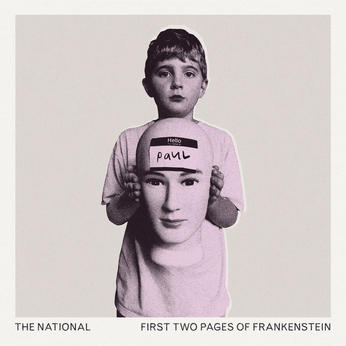
The First Two Pages of Frankenstein (2023)
The market turned. Slightly, but noticeably. Two less than stellar albums in a row and our once ascendant startup suddenly seemed more like a vulnerable, possibly descending corporation. They had become the butt of snarky Tweets. The subject of meh reviews. And so, they did the sensible thing. They went private — got smaller. The National’s ninth album features their most provocative, but also their most specific title. If you think about it, “The First Two Pages of Frankenstein” sounds positively unambitious. It’s not the whole story. It’s not the monster. It’s just the first two pages. This time out, the cast of players is smaller. And the featured vocalists — Taylor, Phoebe and Sufjan — appear not simply for their instruments but because Matt and the band genuinely need their help. Their least ambitious album in twenty years, however, is also their most cogent since “High Violet.” It’s an album just on the other side of depression, with part of one foot still stuck, but emerging. The cover photograph, of a young boy, holding a mannequin head with a “My Name is Paul” sticker on its forehead, is in graytone with a pink hue overlay. It’s gentle and bewildered. It’s the opposite of threatening. It’s the opposite of Frankenstein — the opposite of a Beast. And for the first time in three albums, the band includes their full name and the album’s title right there on the cover. All caps. Normal weight, san serif font. Along the bottom of the photo. A little tenuous, but unmistakable. It’s another gorgeous cover, designed (again) by Pentagram, who appeared less interested in the “brand system” and more in the fundamentals of image and identity. The photograph was not taken by some famous artist. There are no airs of “high art.” Whereas their last three covers were more convincing than their respective albums, this one is of one piece with its music. It captures the inner child of our “Sad Dads.” For those who stuck around for the full arc — who were still holding onto The National’s stock — this is catharsis. They payoff. We’d heard and seen the arc from hobby to startup to company to public institution. And so we fully understand why The National would need to go private again in the end.