
Van Morrison “The Album Covers”
Before he became a craggy, portly Soul man in fedoras and suits, before he was a grumpy anti-lockdown militant, before the Skiffle record and the Facebook rant and a song so profoundly sad (“Pretending”) that it was somehow more depressed than his song about walking out on a friend with tuberculosis (“T.B. Sheets”), before the healing and the silence and the hymns, and before he stuffed himself into that stretchy leisure suit get up for “The Last Waltz,” George Ivan Morrison cared deeply about his album covers.
But that was then. Today, Van survives as the artist whose album cover art most betrays the product contained within. His obsession with “tone” and “feel” is surpassed only by the depth of his disdain for the art that adorns his music. On the one hand, his descent into comically amateurish album cover design has coincided with the transition from LPs to CDs to MP3s to streaming services. In other words, his interest in the physical form has simply reflected the market. On the other hand, Van’s twenty-first century album covers appear less like an adaptation and more like abject contempt — like somebody who resents the fact that his music requires packaging.
This didn’t come out of nowhere — the signs date as far back as “Beautiful Vision” (1982) and “Inarticulate Speech of the Heart” (1983), with their New Age stock photo plus slapped on title fonts. “A Sense of Wonder” (1985) is probably the most humiliating Van cover in that he dresses up as a leprechaun on the front cover, peeking out through a window of leaves like a deranged Keebler elf, while on the back he seems to be doing Sancho Panza cosplay, except in an undersized matador outfit. It would be funnier if it were not true.
It got so bad that, by the Nineties, Van mostly kept his mug off the album covers. The next wave of designs were either photographic abstractions (“Enlightenment,” “Avalon Sunset”) or outlandishly simple candid photos, seemingly taken when the aging Irish mystic was not looking, paired with the most basic, least artful typography (“Hymns to the Silence,” “Poetic Champions Compose”).
There were (very) rare exceptions, wherein either his wife or manager or some masochistic art director managed to elevate the covers to something slightly better than horrific. But, the short lived craft never held. For every middle-aged album featuring a handsome enough photo and purposeful type (“The Healing Game”) there were a dozen atrocities. And just when we thought it could not possibly get any worse, it did. “Keep Me Singing” (2016) looks like something that would get printed on driftwood and sold to vulnerable grandparents at a church craft fair. “Three Chords and the Truth” (2019) is oddly similar, albeit without the photoshopped bird silhouette. And then, of course, there’s “Latest Record Project” (2021), Van’s two hour, twenty-eight song pandemic opus that features a twenty year old PowerPoint theme for a cover. It’s quite possibly the nadir of modern design.
I suspect that there are logical explanations for all of this. For instance, Van’s album making has been described as “workmanlike” — every year he shows up to a studio, records ten to twelve (or twenty-eight) songs with a band of professionals who are there to do their jobs, and then, a few months later, the record is released. It’s like clockwork. The last thirty years of his career has been defined by an unpretentiousness that can appear casual or even disinterested when, in fact, it is nothing of the sort. But that’s the music — the recordings. What sounds like “I’ve been doing this a very long time, just trust me” on record, looks like “I’m a musical legend and I absolutely cannot be bothered with this marketing nonsense” on packaging.
But we care. At least some of us do. We care because we still buy records and we like to hold them and look at them. We care because we are interested in aesthetics. We care because we hope that album covers reveal something greater to us about the artist and the context within which the music was made. We care because Van’s music means so much to us — because, between 1968 and 1974, he made six records that changed our lives. And because, afterwards, he made thirty-six more that thrilled us, comforted us, frustrated us or confused us, but which always made us feel something. But, most of all we care because we know that, once upon a time, Van cared too.
Yes, once upon a time, things were different. Way back when — either because he was genuinely interested or because his wife cared or because he was more vain or less vain or because his record label bullied him into it — Van Morrison made great album covers. And by great I mean either artfully executed or deeply revealing. Or, minimally, that the relationship between the cover and its contents were cogent rather than antagonistic. There was, without question, a time when Van could be bothered to consider his music as commercial product. And while that time has long since passed, we can still look back on his ten finest album covers — those rare instances wherein the design was not simply not awful — when it was stunning or inspired or — at the very least — considered.
10. “Into the Music” (1979)

A two-toned cover — just blue and white — featuring a full bleed portrait of Van, with a peek of his striped collar shirt, a guitar strap and his mostly receded hairline. Van is back! But older. The artist name and title are left justified, set into a thin blue row atop the photo, name in all caps, title in proper casing, both in a banal serif font. Though formally modest, “Into the Music” makes the cut for two reasons: One, the airbrushed portrait is the nearest we ever get to Van’s face on a cover — he lets us get close. And, two, his expression (eyes shut in deep contemplation, lips ever so slightly open) captures a man who’s still healing and who’s still searching. Ultimately, I placed it here, at number ten, because while the album is uniformly excellent, its style does not match its cover — at least not until the final three tracks. “And the Healing Has Begun,” “It’s All in the Game” and “You Know What They’re Writing About,” are a majestic, twenty-minute stretch of Caledonia Soul that confirm — like the cover, and contrary to rumors — that Van still had it.
9. “A Period of Transition” (1977)
Among the most “designed” of Van’s album covers. A fifteen photo collage showing him pondering, smoking and — in one shot — nearly smiling. His name rightfully occupies a significant area in the upper left corner, all in caps, in a font that looks hand rendered. The title is lowercased, underlined, above and to the right of his name. Van is wearing the same outfit in each photo — a light blue, Seventies leisure coat and a darker, wide collared shirt. This album, which was released after a three year hiatus, is — as its title suggests — a restless, unresolved effort, stuck between his early Seventies work and his return to form, “Into the Music.” It’s a better cover than it is an album, but it does accurately capture this moment in Van’s career.
8. “Days Like This” (1995)
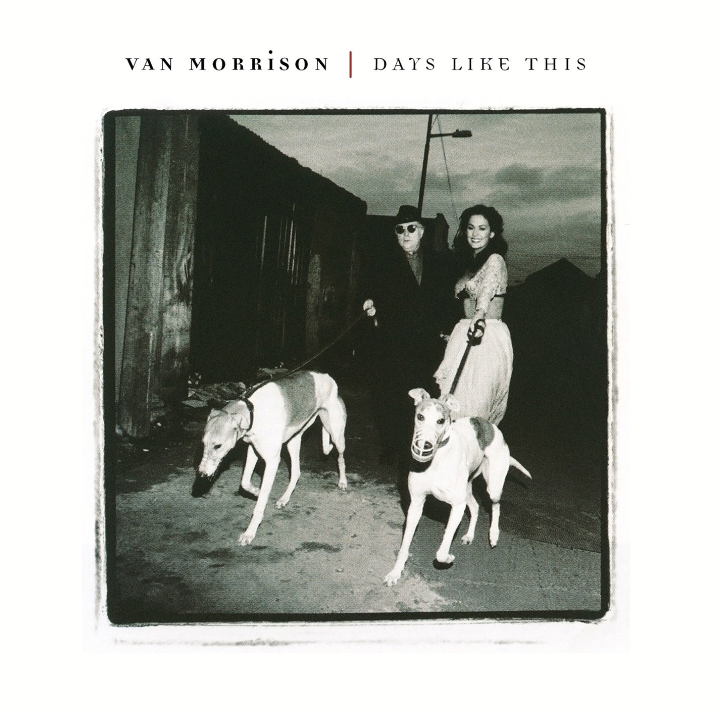
The only post-Seventies inclusion on this list adorns a solid, if unexceptional mid-Nineties effort. The cover of “Days Like This” is notable because it captures Van with his ex-wife and former Miss Ireland, Michelle Rocca. It’s a simple, black and white palette with a subtle, delicate typeface. More importantly, it’s one of just two album covers featuring Van alongside a romantic partner (more on that later) and one of two that show Van with a pair of dogs (more on that later as well). And though the callbacks are obvious and revealing, and though the dramatically spotlit, black and white photo is compelling, the cover is ultimately most special for one simple reason: Van looks kind of happy. Period. In this way, the art betrays the lingering sadness of the material ("Underlying Depression,” “Melancolia,” “Russian Roulette”), but it was nice to see the old guy getting some action and taking his greyhounds out for a walk.
7. “Tupelo Honey” (1971)

And we’re off. Van is wearing diamond patterned bell bottoms and a brown tank top, looking surprisingly studly with his long flowing hair and trim goatee. Moreover, he’s at one with nature, walking alongside his wife, Janet Planet, who’s riding a horse bareback in a wooded forest. The artist’s name rests above the color photo with the album title below, both centered. The background color is a patinated yellowish-white, befitting the sun-kissed, stoner vibes of the image. And though I’m sticking to covers, I can’t not mention the rest of the album’s photos, which feature Van in a suit and scarf, sitting on a fence while his wife (and horse) stand adoringly nearby. This is high, early Seventies, Bay Area bohemian love incarnate and a perfect visual for an album that includes songs like “Old Old Woodstock,” “I Want to Roo You” and “Starting a New Life.”
6. “Moondance” (1970)

Portrait of the artist in full bloom. Or rather, five portraits of the artist. One, larger than the rest, rotated ninety degrees clockwise. The other four, smaller, stacked and vertically aligned along the left alley of the cover. A yellow-orange hue accentuates the singer’s brown eyes and his auburn facial hair. The name and title are all lower case, left right justified above the larger photo. This is not the most interesting of Van’s covers, but it might be his most cogent. It captures a deep thinker and soul — a man and an album to be seriously considered.
5. “St. Dominic’s Preview” (1972)
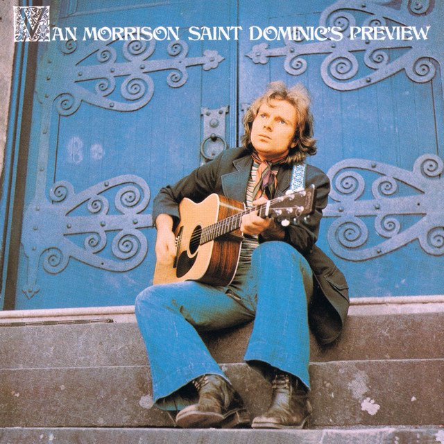
A full bleed, full color, full body photo of Van seated on cathedral steps, in a dark blue blazer, denim bell bottoms, a paisley-ish scarf and well-worn boots, playing his acoustic guitar and staring off towards some higher calling. Like the decorative features of the church doors, the artist’s name and album title are rendered in ornate, fully capitalized letters, including an oversized “V” for Van, which is ensconced in Gaelic flair. At a moment wherein Van was more Caledonia troubadour than psychedelic songbird or Irish Soul man, this cover checks all the boxes. The lone photo does (almost) all the work.
4. “It’s Too Late to Stop Now” (1974)

One of the great live album covers of all time — his name emblazoned atop with the first “O” in Morrison operating as a spotlight and the rest of the name sparkling like an Art Deco sign. Stage lights criss-cross above Van’s head while he clutches the mic with his left hand and points off with his right, presumably conducting his band and feeling the vibrations. The singer looks downward, dressed up for the occasion. You can’t exactly see his eyes, but they are surely closed anyways, lost somewhere in the slipstream. In his pose, he recalls another great bandleader — The Godfather of Soul — slightly bowed in appreciation and in reverie. This is the perfect pose for the end of the ecstatic, ten minute version of “Cypress Avenue” — exhausted, enthralled, into the mystic, into the music.
3. “Astral Weeks” (1968)

Did you assume that this would be number one? Or, worse, did you think I’d forgotten it? Because the music is so transcendent and so iconic, it’s hard to separate the cover from what’s inside. I suppose that’s a good thing — that “Astral Weeks’” cover doesn’t get in the way of the music. As to whether it adds to it, I’d say “yes, mostly.” Young Van, just twenty-three — goatee-less — is captured head tilted down, hair tousled, framed in a circle with a gray-green outline. Surrounding that circle is a square with a purple outline that is filled with a semi-translucent green tint overlaying part of Van’s chest and a sliver of his head. It’s unclear if the trees and leaves that surround him are a separate image or if the photo is taken from behind glass (a window) and capturing a reflection. In either case, the circle within the square and the shadows of branches and leaves signify something both mystical and natural. The name and title are capitalized, rendered in purple in a delicate font that could pass for either quasi-Deco or quasi-Gaelic. Ultimately, that’s why this cover works so well — it communicates something old and something new, something psychedelic and something earthly.
2. “His Band and His Street Choir” (1970)

A double exposure of Van, wavy bob hairdo, perfect goatee, looking off to the side, possibly adrift, possibly lost inside the slipstream. One shot, recessed, is just his face. The other, more pronounced, reveals him to be wearing an authentic, full length kaftan. Many people (Van among them) absolutely hate this cover, claiming that it inaccurately portrays the singer as a hippie, which was only barely true. Some Van devotees also (rightly) point out that that the images have “heavy Manson vibes.” And listen, I won’t argue with any of that. But I will say this — Van looks fucking awesome here, kaftan and all. You say he looks ridiculous? I say he looks ridiculously great — never better. You say he wasn’t a hippie? I say he married a woman named “Janet Planet,” wrote a song called “Gypsy Queen” and willingly bought a kaftan in Woodstock, New York. You say that Van half disowned this album? I say, “Domino” is an all-timer, Seger covered “I’ve Been Working” and most of the album is deliciously romantic. For those who think this cover bespeaks a sappy cliche of hippie ideals, I say “absolutely.” If it were not for his occasional idealism, Van would have been a completely cranky, new age weirdo. This cover is what San Francisco would have looked like in 1970 if Altamont had never happened.
1. “Veedon Fleece” (1974)

It doesn’t get any more Irish, or more personal, than this one. Van, flanked by two gargantuan Irish wolfhounds, sitting on what I imagine to be peat moss (but which I know is not) in front of a former castle in Dublin, as the wind sweeps through his slightly thinning hair. Van’s lost the bellbottoms and the kaftan, donning a professorial suit and tie, as if to confirm that he was taking this one seriously. The photo has been put through some high contrast filter, accentuating the green of the grass, the black of the suit and the pale blue of the sky. Like its cover, the album itself is among Van’s most personal, least romantic, least mystical records. “Veedon Fleece” was a criminally underrated album, briefly out of print and only recently rescued. The title means literally nothing (it’s made up — Veedon Fleece is not a thing) and also everything (Veedon Fleece is some magical talisman). On the cover, the artist’s name and album’s title float gently in a subtle, forest green type above the dreamy composition. “Veedon Fleece” was a goddam treasure that most of the world passed on in 1974 despite the fact that it’s the only known record to contain a quadruple negative: “You Don’t Pull No Punches, But You Don’t Push the River.” Moreover, it’s Van’s greatest marriage of album and album cover. After this, there was nothing else left to do. He took three years off and then released three dozen more albums, giving zero shits about what the covers looked like.